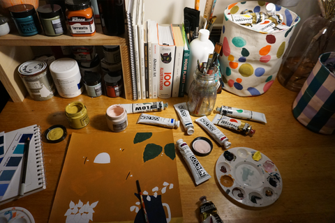
His favourite flower was the carnation. He regularly gifted a big bunch of these old fashioned (underrated IMO) pink beauties to Carla’s mum.
As with all of Carla’s flower wielding, joy dispatching girls this bounding beauty has skipped into our lives when we need a reminder to pursue our dreams and listen to our hearts. To look forward. To hope. To cultivate a life that fulfills our needs.
This new girl is perfectly named “Follow Your Bliss” and this is her story…
“The secret to getting what you want in life, finding your people, feeling motivated to get out of bed in the morning, to have a skip in your step, is to follow your bliss.
Following your bliss and what in your heart feels true is not whimsical or irresponsible, it’s deep communion with your higher self and creates profound personal fulfillment, joy, a sense of belonging to a community and to this beautiful world we live in.
You know when you are connected to something you really want because you feel excited, enthusiastic, and you radiate joy, your energy bubbles over and off you go without needing any prompting at all. A heart’s desire gives you a rudder that pulls you along, a clear path starts to form and you know what to do next, you have the courage to keep taking steps, one choice at a time.” Carla Coulson
I hope you find her as beautiful, joyful and life affirming as I do.
I love her.
Kara
]]>
Left: 'KERRIE OLIVER - KNOWING MYSELF TOO WELL BUT LEARNING WHO I AM NOW' Right: 'KERRIE OLIVER - THE BOOKEND'
Left: CLARE PURSER - 'KULGUN III' Right: CLARE PURSER - 'KULGUN IV'
-
Sophie paints with a certain pace, mixing colours directly on the canvas and limits her palette to primary colours to simplify her process. This is evident in the five gorgeous new works she has created for Forman, including a light turquoise kitchen scene titled “Put it on the list.” There's a sense of nostalgia to this artwork, pastel colours suggestive of 50s decor and the clock, a reminder of passing time. The pale yellow outside the window could be a sunrise, the scene depicting the moment you wake, walk to your kitchen and make coffee. Stillness before the rest of the house wakes. It captures something we can all relate to. Sophie describes her distinctive style as expressive, colourful and varied,
“I try to respond to what I see and allow this to very subjective process, and reflective of my mood, thoughts and feelings, not just what is in front of me. I like to paint in a loose and immediate way and mix my colours as I go, often on the canvas. I do not try and plan my works too much and let the process lead the way.”
There is a naivety, or a candour, to her loose lines and scratchy brush work, some only suggestive of form with a flick of the brush, while others are representational of vases, jugs, washing machines or a fruit bowl, for example. Looking at her work, one can sense the artist creating order from the chaos of life and dispelling the notion that art and life are mutually exclusive.
“I am very interested in dual processes such as making art and raising children, making art and working as a social worker, making art and trying to work on the important relationships in my life.”
While Sophie loves to paint un-interrupted in her studio, the reality of her domestic life, home life and work life mean this is an elusive concept. Instead, she tends to paint where-ever and whenever she can – the kitchen bench while her partner cooks, for example!
“I cannot be precious about where I paint or the conditions I need as these are often unattainable. Hence the kitchen table when I am not at the studio.”
Her dream is to participate in an Artist in Residence program, where she can focus on creating a complete body of work in a beautiful, inspiring place, away from the responsibilities and distractions of daily life. When she does get to her studio, located in one of the most beautiful parts of Tasmania, Verona Sands, she enjoys immersing herself in nature and walks on the beach to nourish her creativity.
“There is something calming about getting away from home, and closer to the nature, that enables the creative process.”
Colourful, bright, optimistic and busy, Sophie’s work is process-driven and un-planned, depicting interior and exterior landscapes that we know will resonate with you! You can view all of Sophies gorgeous artwork HERE and pop into the Forman gallery to experience them in person.
]]>
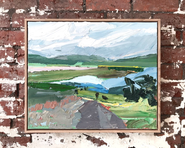
One such artist, Orla Cook, has just delivered a range of 9 unique pieces to Forman. We are rapt to add her to the Forman family and excited for you to see her work jump off the walls. Using a colour palette reminiscent of the mid-century modernist movement, Orla experiments with geometric forms and fluid linework.
She works from her home in Melbourne’s eastern suburbs and has made art through a variety of mediums all her life. She chose to study a Bachelor of Science, she muses, instead of art – but this is perhaps what makes her an interesting emerging artist to watch in 2022.
A self-taught fibre-artist and a very gentle soul, Orla was initially drawn to clay and ceramics, but it was the combination of colour and materiality within wool that really captured her heart. She has dedicated countless hours to mastering her craft and like many of us, used the long hours of Melbourne’s lockdowns to re-focus her attention to what really matters to her; the pursuit of creativity. We are so excited to be able to share her first body of work with you!
What has your journey in art looked like? When did you first become interested in art? How long have you been creating art?
Like many artists, I was an obsessive creator as a child. My mum loves telling the story of 2yo me in a high chair, yelling “More paper, more paper, more paper!!” as I frenziedly scribbled out endless drawings with my crayons. I was that classic off-in-their-own-world imaginative kid, and so creating with my hands brought me outside my mind and into the physical world, utterly fascinated with making my ideas tangible.
While I have drawn and sketched for as long as I can remember, my first true art love was ceramics. I was introduced to the medium by the truly fabulous art department of my high school, and was totally enamoured with the physicality of building and shaping a form from a shapeless lump of clay.
I chose to pursue my interest in science subjects instead of art and went on to complete a Bachelor of Science at university, majoring in Ecology. Fast forward a few years and the seemingly endless time of Melbourne’s first pandemic lockdowns finally gave me the mental space to create. I have been weaving and working with wool since 2017, but the lockdowns supercharged my creativity and I simultaneously noticed an incredible upwell of happiness and calm appearing in my life. I made a commitment to myself there and then that I would never not-create ever again.
I think I’m drawn to wool because of that physicality element that I loved so much about clay. But wool has the added bonus of being already chock-full of colour – it’s that magic combination of colour and texture that puts stars in my eyes as I walk through a wool shop! There’s a wonderful energetic quality to wool. The hard edges of a design are softened, warmed; allowing colours and shapes can be both bold and gentle simultaneously. It’s quite a marvellous phenomenon!
Do you have any formal training? Or how did you develop your skills?
My skills in creating fibre art come from years of straight-up, old-fashioned practice. When I was learning to weave I found free resources online to learn the basics, and through Instagram I was so inspired by what textile artists around the world were making. This was also how I discovered punch needle embroidery – there is a fabulous maker named Arounna Khounnoraj in Canada whose work had my jaw dropping, saying “Oh man, I have to try this!” Countless hours of refining my skills and technique later, and I couldn’t be more in love!
What medium(s) and techniques do you use? What themes do you explore/ What do you try to achieve with your art? What inspires you?
My work is a little unusual in that is made entirely of yarn: thousands of tiny loops of wool that are individually poked through fabric with a punch needle, and then stretched over a frame. It’s highly labour-intensive, but luckily I find the slow process of building an artwork loop by loop wonderfully meditative.
For as long as I can remember I’ve loved abstract art, and have a strong affinity for shapes and geometric design. The thing about abstract artistic expression for me is the symbolism – the way that something that isn’t anything (i.e. not a recognisable object or figure) can communicate such a depth of feeling has always captured my heart. This concept of making things that are intangible, tangible, informs much of my work. For me, abstract art has an amazing way of reflecting a feeling back to you – as if you somehow recognise something in yourself being mirrored back by the art. For me as an art-viewer that’s the biggest kick – the sensation of seeing an artwork and going “Yes!! THAT is how I feel inside!!”
I think this is some of what I try to achieve with my own work; expressing feeling and energy in a visual language. Sometimes I’m describing gentle, quiet energy – with flowing curves and harmonious colour schemes. Other times I’m expressing big, bold feelings of confidence and joy and strength – which I think are where the zig-zags come from, being so sharp and bold in shape and colour scheme!
My geometrics are all about composition – exploring themes of balance and imbalance through arranging simple shapes. I am a HUGE fan of hard-edge geometric painting. I’m interested in how the softness of wool warms up the harsh lines of the style, creating geometrics with a gentler atmosphere while still holding their edgy (no pun intended!) aesthetics.
My designs and colour palette is influenced a lot by the Mid-Century Modern design movement – the balance between visual minimalism and playfulness with pops of colour really speaks my language! I particularly love warm and retro-style colour palettes, with a balance of light and dark. I’m also endlessly inspired by the colour wizards of art – think David Hockney, Van Gogh and Brett Whitely, and modern artists Heather Day, Adébayo Bolaji and South Australian artist Greta Laundy.
What is your creative process?
With textile art you really need to be a planner. You can’t simply just ‘paint over’ a colour that isn’t working when you’ve spent an hour filling in that space, it’s just not practical! So the vast majority of my work is designed in some way before I start. I sketch out ideas on paper and on my iPad – which I LOVE because it’s zero waste (that’s the ecologist in me talking!).
For me the key is to keep exploring until there’s a certain “somethin’ somethin” catching my attention. Then I play with colours, which are usually chosen based on what I have in my yarn stash, which really help bring a sketch to life. When a composition has presence, a certain expression, feeling or character, I know I’m onto a good thing. Sometimes I have a specific (or even vague!) sensation that I’m trying to express, other times it is pure creative play. It’s very much about listening very closely to a sensation that’s bubbling away in my subconscious, and trying to give it the space to reveal and express itself. Once I’m happy with how a composition is feeling, I trace in onto the fabric and start creating the final piece in wool.
There are other times in which inspiration comes as a flash across my vision, usually a distinctive shape or line that I must immediately scribble down somewhere. I love that aspect of my creativity – it’s as if it has its own idea of what I should be making, and is more than happy to interrupt whatever I’m doing to let me know! It certainly adds an awesome element of randomness and fun to my creative process!
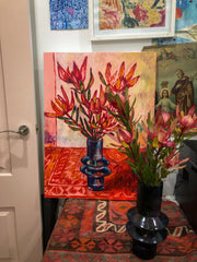
Orla’s works are currently adorning the walls at Forman and we’ve already had so many glowing comments, so please come in and enjoy them IRL for yourselves, or pop over to our website to see more.
]]>
Above Left: 'SUNLIT WATTLE WITH SMALL PINK VASE' Centre: 'GOLDEN WATTLE, RASPBERRY GLASS AND FRIENDS' Right: 'LEMONS, GREVILLEA AND AQUA GLASS'
Left: 'AQUEOUS BLOOM LIFE FIELD XV' Right: Work in Progress in Jaquelyn's studio.
Jacquelyn's studio is in a 1950’s building that feel like the set of ‘Madmen’ with 50’s timber walls, parquetry floor and amazing tiling in the entrance.
While experiencing Jacquelyn’s work, it is easy to get lost into the little worlds her paintings create. From childhood Jacquelyn formed a deep connection with the ocean. She grew up by the sea off the southern coast of Australia and now enjoys living and working near the coast in Melbourne. Jacquelyn works from her studio based in the Bayside Arts Precinct of Advantage Road in Highett. Her favourite way to begin a typical day painting in her studio, begins with a coffee and a quick walk along the foreshore at Sandringham from which she draws many aspects of her inspiration.
“I knew that there was something about the profound beauty of life and existence that was in the ocean above and below the surface. Something that was universal and worthy of sharing.”
Left: Photograph of coral taken by Jacquelyn on one of her morning walks. Right: Close up of 'BIO BLOOM-CEPHALOPOD MAGIC II'
“In my process, I call upon nature itself to make the work. I engage random methods to allow the compositions in my paintings to grow organically using earth, air, water and fire to create the ovoid and cellular forms seen in the work. Because I work in many layers each painting could continue to grow forever so I have to just stop at a point where I know the painting is breathing and has its own life.”
Inspired by a wide range of influences, Jacquelyn considers herself indebted to the sublime atmospherics of romantic painters Casper David Fredrick and William Turner. You may often see their influence in her backgrounds. Colour, light and movement she learnt very early on from the Orphism of Sonia and Robert Delaunay, which is possibly where her use of the circles and ovoid’s started. More recently she is inspired by artists Bridget Riley, Victor Pasmore, Chuck Close, Emily Kame Kngwarreye and Yayoi Kusama.
'THERE WAS SOMETHING IN THE AIR I '
Jacquelyn’s paintings offer a magical adventure for the wanderlust viewer. Journeying into them certainly evokes the astonishment and appreciation of our world that Jacquelyn aims to achieve.
“I aim to trigger a sense of awe and wonder at nature and the miraculous building blocks of life. The images allude to microscopic and macroscopic forms to make connections to the fragile natural world.”
You can view all of Jacquelyn Stephens work here.
]]>It is our pleasure to introduce you to our new artist Tania Blanchard! Tania is an Australian artist based in Burleigh Heads on the Gold Coast. Her artwork is known for her own signature style, building layers of “impasto dots” reminiscent of a minimalistic and impressionistic scene. This unique method of application gives her paintings a mesmerising effect and an indulgent texture you almost want to reach out and touch.
“I’ve always been obsessed with colour, colour theory and combining it with texture. Texture is something I am very drawn to”
Tania grew up in Adelaide where she obtained a degree in Visual Arts and a diploma in Graphic Design. She has developed and evolved her style over the last decade, practicing her skills and learning to trust her intuition.
In early 2020, Tania made the decision to move from her old studio space and build a large studio at her home that she now works from. Her typical day begins with a Chai Tea, or three, her paint spatula in hand and her dog Millie by her side.
Working with acrylic on canvas, she hand mixes her paints with a thickener to get the consistency she desires. His helps achieve the lush texture in her paintings that she applies in layers with her palette knife. Tania also records every colour she uses in each artwork, which can sometimes be more than 100 different hues in a single work!
“I’ll explore anything and everything. The only thing that stops me doing more work on a piece is time. My technique takes time and can’t be rushed. If I didn’t spend so much time with each painting I truly believe the “Wow” factor would not be there.”
Her inspirations include greats such as Matisse, Mark Rothko and Josef Albers whom she admires for their use of colour and their compositions.
'Gravitation' - 1400 x 1400mm
Tania’s work has been described as hypnotic and emotional. She likes to push colour variants using colour to provoke emotion. Anyone viewing her incredible artwork in person could not deny the effect. You can shop her work here or visit our gallery to experience it in person.
]]>Left: 'Tangerine Kitchen' - 430 x 530mm Right: 'Early Fall' - 340 x 440mm
Audrey has developed a style that is inherently her own, full of texture, clean lines, beautiful colour and retro vibes. You can shop her artworks here.
For the mum that takes great joy in her garden, these gorgeous floral artworks by Rachael Little bring comfort and cheer without even requiring watering! Shop her works here.
We've created collections to make it easy for you to shop in accordance with your budget. You can view our artworks under $500 here and under $1000 here. And If you feel like splurging on an incredible piece of art, you can find our large scale artwork here.
These Carla Coulson prints inspire women to look within at their own beauty, find their uniqueness and tap into their power, a beautiful gift for any mum! Shop them here.
For the jet setting mum who is now an armchair traveller. These beautiful works will take you around the world to Europe and back again. Shop this breathtaking collection of prints here.
When abstract is her thing, these playful treats by Laura Thomas will satisfy her lust for colour. Shop Laura’s work here.
For when you want to blow the budget, these incredible works pack a huge visual punch and make an extraordinary gift, like this one by Tania Blanchard. You can shop our range of large scale artworks here.
Happy browsing and have a wonderful Mother’s Day with your loved ones!
]]>
With a focus on the psychology behind colours, Angus balances overlapping contrasting shades to strengthen the impact of his work and evoke emotions from his audience. Each piece of work is highly symbolic, harmonious and unexpectedly emotional as every piece holds deep meaning and hidden positive affirmations that act as daily reminders to the viewer.
Everything about Angus exudes that free-spirit energy you’d expect from a visual artist.
“Everything happens for a reason, there are very few coincidences,” he reflects. “If you can start to recognise the reasons, you can find deeper meaning, not just in life, but in art too.”
Angus’ creative roots began in hairdressing before going on to study graphic design and being awarded the South Australian Arts Excellence Award. He has also worked as a designer in advertising. His eclectic creative skills and background enriches his work and comes through in his paintings.
Working from his home studio, his favourite colleague is his little French bulldog Dolly - even though she’s not much help and sleeps on the job, she’s still great company!
“I like creating at home as I like the solitude - clear space, clear mind. I regularly burn Palo Santo to cleanse the space, uplift the energy and also draw in creative energy. I like being surrounded by plants, lots of natural light, and music, always!”
You can view Angus' artworks here
Using predominantly paint on canvas including acrylic, oil, oil stick and collage, Laura begins by creating naive marks, shapes and patterns opposed to replicating what she see in a literal sense. Her creative process is very intuitive. Keeping it as organic as possible allows her to create happy accidents and add richness and depth. It usually starts with observing a space, object or composition and looking beyond the initial scene.
“I will examine the negative space in between edges and lines, examine outlines and pattern, shape and colour. My sketches are automatic and quick which I then use to create a rawness in the painting. If I feel my work is straying from my vision or I am not satisfied, it is a good time for me to stop and reflect. I go back to my main objectives and always refer back to my sketches and resources including artists that inspire me such as Matisse and Cézanne to get me back on track. The turning point for me is when I want to throw the canvas out and start again, this frustration often brings out my best work!”
Laura’s work pushes the boundaries of conventional still life. Taking inspiration from artists such as Matisse, Cézanne and Kandinsky, her paintings celebrate everyday objects with their intense colour and examination of space and form.
“I am happy with my work when the painting can be interpreted differently by various viewers, this sense of ambiguity combined with a familiarity of environment is desirable for me in my work.”
You can view and buy Laura’s painting here or pop into our gallery to experience her work in person.
]]>
]]>
This new piece is limited, so click here to take home this bewitching piece!
]]>Fleur was born and raised in New Zealand and is now based in Sydney, living with her family and working out of her home studio.
She studied Visual Art at Swinburne Senior Secondary College in Melbourne in 2001 but at the time chose to pursue a career in arts administration and to travel - rather than becoming a professional artist.
Then, in September 2017, Fleur turned her practice into a profession:
“Since having my son, I’d danced around the idea of turning my very casual art practice into a profession. It took shape one day at my local café with a strong coffee and art journal in hand - I started with an ABN and a domain name.
Two months and 25 paintings later, I had my first exhibition at my local library in Sydney and spent every spare moment I could, drawing, painting and visiting galleries.”
Image: ‘Passing Through The Hawkesbury River’ - 43cm X 43cm
(Acrylic and spray paint on board)
Fleur’s interest in art began when she was young, saying her earliest memory was the first art journal she had as a kid, and it was “filled with drawings of punks, which could have been a direct response from to going to Sunday school!”
Fleur has spent time developing her skills - in her studio, painting and drawing studies out in the landscape and attending workshops lead by professional artists.
Image: (L) ‘A View Through A Landscape’ - 33cm x 33cm & (R) ‘Sofala In Summer’ – 33cm x 33cm
(Acrylic and spray paint on board)
“I find inspiration in so many forms and from such diverse sources. From reading and writing, to visiting galleries and listening to creatives ‘geek out’ on their process, in just about any industry.”
Image: Fleur on location at Yellow River painting ‘en plein air’
“My main source of inspiration comes from painting in the landscape itself. It offers a wealth of colour, texture and form, changing with every visit and is a constant reference in my practice. One of my favourite things to do is to load up the van with art supplies and head out into the country with my art gals. We spend our days painting in the landscape and our nights talking all things art and having lots of laughs.”
In Fleur’s compositions you’ll find contrasting elements: blocks of stencilled colour, painterly brushstrokes and gestural spray-painted marks, of varying shape and form, texture and colour, where she hopes to convey a dynamic, abstracted landscape.
Image: a close up of Fleur working on a composition
(Photo credit: Matt Clark Photography)
Working with the mixed media of acrylic and spray paint, Fleur’s paintings explore the negative spaces objects between - permanent and temporary - found in the landscapes she visits. She invites us, the viewer, to navigate around her work and then complete our own narrative.
The combination of the acrylic and spray paint gives Fleur’s work a cool combination of a modern edge with a rebellious quality – which we love! This versatility means her work will find its home in so many different places.
I created this girl for Victoria and all the folks around the world who are still in lockdown. Her name is 'Hold The Faith' and this is her story.
]]>"This year has created chaos in the world and our lives and our knee jerk reaction is fear. The trick when we feel fear is to move towards a love emotion, kindness, compassion, faith, generosity, and caring.
I created this girl for Victoria and all the folks around the world who are still in lockdown. Her name is 'Hold The Faith' and this is her story.
Faith is stronger than hope, it’s the willingness to believe without a doubt that something good or a particular outcome is going to happen without proof or results. It’s the magical place from where anything you want to bring to life can grow. Faith is like planting seeds you devotedly water knowing one day they will bring fruit yet you continue to water them even when there are no signs of buds or sprouts.
This girl knows to ‘hold the faith’, it means that when things aren’t going as she wished, her outcome still hasn’t shown up, times are tough, rocky, scary or unknown, she chooses to take a step in the direction of a dream or desire knowing it will happen.
Every small step you take, you are rallying forces you can’t see and it’s the elixir that will bring to life what you want.
She knows good things are coming her way, she is standing strong in times of chaos and uncertainty and that faith is her secret weapon. She knows it’s yours too."
This beautiful piece is limited, so add her to your life now - and with such an appropriate message for everyone, here and now in 2020, how could you wait!
Click here to snap up this beauty.
]]>Already having a professional background in Occupational Therapy, Debbie went on to graduate from Holmesglen TAFE in 2014 with a Diploma in Ceramics.
Read on to learn more about Debbie and her work.
We fell in love with Debbie's stunning vessels as soon as we saw them. Her pieces are glazed in neutral tones, they're raw and textured on the outside, glossy and smooth on the inside and they're functional! We recommend filling them with fresh flowers from the market then displaying them next to your favourite painting.
Debbie loves the feel, the messiness and the magic that can happen when she’s in her studio. She describes her time in the studio as being “passion filled” and an “ever-evolving challenge”.
Image: Debbie installing her work.
One of the main themes in Debbie’s ceramic practice is connection and belonging. This sense of belonging is created when her pieces are arranged in groupings of three or five. They sit together seamlessly, one piece leaning into another, forming clusters and families. Each piece belongs to a bigger picture.
Debbie takes inspiration from her environment and the objects around her. She often finds herself looking at day to day objects and imagining what they would look like if she made them out of clay. The ceramicist finds it grounding to work with clay and loves working with a natural material that feels like it has no limits.
Image: Debbie's vases in our gallery. You can shop her full collection in store.
"Clay is both direct and honest in its response to touch leaving infinite possibilities to explore which can be satisfying, challenging and at times frustrating. I enjoy watching forms unfold before me and I'm always trying to remain open to change and refinement."
Clay is a constant reminder that things can’t be rushed or forced. It is a slow and soothing process. Debbie finds it meditative to be in her studio making work and embracing imperfections along the way.
“Working with clay can be like an open ended conversation, you never know from one time to the next where it can take you.”
Debbie takes particular joy in knowing collectors find a unique place within their home for her works and so do we.
Debbie has been exhibiting since 2010. In 2018 she was awarded People’s Choice at the Valley Potters 40th Anniversary Exhibition. Her works are held in both private and commercial collections throughout Australia.
Visit the gallery to shop Debbie's collection of ceramics.
]]>The landscape painter says that the light almost "feels more vivid there". There must be something quite spectacular about the warm sun illuminating the grasslands of the Barossa. These broad landscapes have, in turn, broadened the scope of her art career, inspiring her to develop an innovative (and frankly gorgeous!) method of abstraction.
Image: Detail of Tree Lines + Distant Hills (125cm x 71cm) oil on canvas.
Lise, like many artists, has worked hard to reach the point in which she is able to spend most of her time painting. She started a degree at art school in her late teens but soon decided it wasn’t for her, “I dropped out, frustrated that my questions weren’t being answered and thinking I should get a real job." Luckily, it didn’t take her long to find a new community of like-minded creatives to bounce ideas off. Lise spoke about how this community support grounded her when she began painting again.
“A group of generous artists in a shared studio encouraged me to work and learn with them and I ended up doing an informal apprenticeship there. I met my partner Roland Weight at this time. He is also an artist, and an experienced teacher. I rely a lot on our critical interaction during the process of art making and feel very lucky to have someone to bounce creative ideas off when I hit a brick wall!”
Image: Lise's studio.
Lise’s carefully packaged paintings arrived at the gallery earlier this month. Unboxing them felt exciting, like unwrapping a gift on your birthday. The quality of the thick oil paint she uses is even more lustrous in real life. Lise's paintings are simultaneously dynamic and subtle, just one confident stroke of paint can capture the delineation of a mountain and a few delicate marks allude to the existence of a canola field or distant wattle trees. The tension between her more representational details and abstract pains of colour draws us in and keeps us engaged. We can't stop looking at these beautiful paintings.
Image: The Road In (64cm x 54cm) oil on canvas.
Lise loves the immediacy of oil paint and builds up textural plains of colour using her collection of indispensable palette knives. She walked us through her process and spoke about how she uses photography and collage techniques to create her landscape compositions:
“I generally begin by shooting hundreds of photos from the car whenever I’m a passenger. These photos become the source for collage making, which is how I compose my designs. Once I have a composition I like, I use it as a maquette for a painting. The painting process is quite loose with further developments to the design always occurring in the studio. I like to allow for accidents to play a part and will sometimes make several different paintings from the same collage with the resulting works ending up quite different.”
Image: Autumn Vines (64cm x 54cm) oil on canvas.
Lise’s an award-winning contemporary artist. We're thrilled to welcome her and her remarkable paintings to Forman. A few of her standout achievements are as follows:
Winner – City of Burnside Prize 2013.
Winner – Watershed Art Prize 2013.
Winner – Clare Art Prize 2011.
Winner – Barossa Art Prize 2011.
Winner – Best Regional Artist – Heysen Prize for Australian Landscape 2007.
Winner – Heysen Prize for Australian Landscape 2005.
Shop Lise's collection here.
]]>
In 2007, Brian completed a Bachelor of Creative Industries, majoring in Visual Arts at QUT Brisbane. He now works as an artist full time, exhibiting frequently, completing commissions and painting murals for both private and commercial clients. He has now completed 20 murals, countless commissions, and exhibited throughout Australia. His work has been featured in Vogue Living, The Collective Hub and Instyle Hair magazine.
We welcome Brian with arms wide open!
]]>Styling by Cassie from CJH Studio featuring artwork by Marika Borlase.
Styling by Cassie from CJH Studio featuring artwork by Nunzio Miano.
Styling by Cassie from CJH Studio featuring artwork by Jo Dyer.
Styling by Michelle from Bask Interiors featuring artwork by Emily Persson.
Styling by Michelle from Bask Interiors featuring artwork by Marika Borlase.
Styling by Janita McMahon from Calamity Jane Interiors featuring artwork by Michelle Kettle and Sally Browne.
Leonard’s masterful use of oil paint has made us fall in love with her stunning still life paintings. She invites us into intimate domestic moments. We see ripe figs next to speckled handmade ceramics, an orange persimmon placed next to deep purple foliage all of which are painted with thoughtful colours that compliment each other perfectly. The surface of her paintings are rich and textural.
Leonard’s constantly collecting from her surroundings and using her findings to establish compositions “I also usually like to include something from nature, like a stem of wattle collected on my morning walk or a few Birds Of Paradise blooms from outside my bedroom window”. She always begins the painting process with a warm raw sienna underpainting. During the underpainting stage, Emma plans her composition and preps a base that gives her artwork a warm glow.